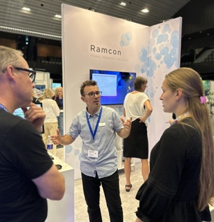
New visual identity
We have recently introduced a new visual identity to symbolize Ramcon moving forward, as well as to give our brand a more contemporary and modern look.
Our new visual identity revolves around a cluster of circles. The cluster of blue circles represent complexity, knowledge, connections, networks, cells, particles, molecules, atoms -a mass of elements that together amount to a large complex whole.
The logo
The circular shape is the starting point in our new logo and symbolize the core elements in science and research - cells, molecules and atoms, with a 45-degree upward angle to visualize our constant movement towards new milestones in science. The three overlapping circles represent the three words in our tagline – and our reason to be: People, Products, Solutions. From our network of innovative global suppliers with their best-in-class instruments, systems and reagents to the brilliant people working here, combining their in-depth market, customer and tech knowledge to create unique customer centric solutions.